Case Study: Brightside Physio
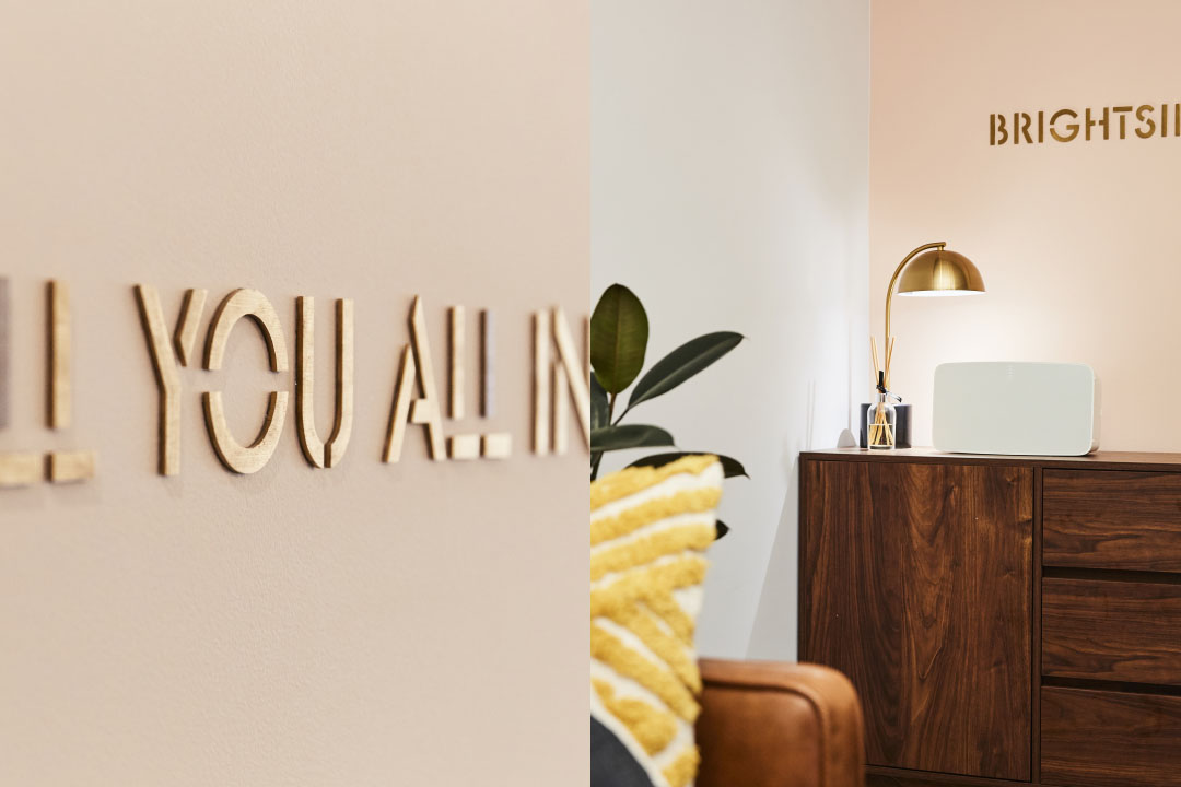
ALL YOU. ALL IN.
Clinical atmosphere, indefinite treatment, and low motivation—these are the common perceived problems visiting a physio. Many only go if they absolutely have to. What if things were different? The future is bright.

MISSION
Create a fresh physio experience. A break from the clinical and compartmentalised way of healing toward a more human, hopeful and holistic treatment with no hidden surprises.
PROCESS
Brightside Physio went through the process from strategy, identity, website and store design from scratch to create an aligned experience away from pain and into life.
ENGAGEMENT
• Brand strategy
• Brand story and high level messaging
• Brand idenity and toolkit
• Responsive website
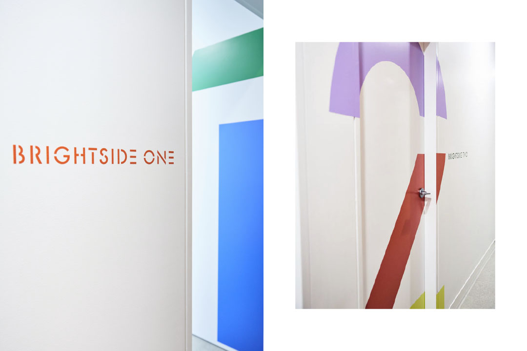
• Store design and signage


“Right back at the start of Brightside I sort of knew that I didn’t know and I knew I needed help to know. I had no reference points, no brand, no identity and a gaggle of truly terrible business names. It felt like I had just taken off on a giant business wave with a paddle pop stick as a surfboard. Grant from NPU was someone I knew could help guide me and (to stretch the analogy) — help build the surfboard and learn how to surf.
“He was patient enough to coach me through branding, visuals, colours, values, web presence and even interiors when my knowledge base was slim and my goals were large.
“I think of Grant as my co-constructor of a business that has gone from a startup to 5 staff, 120% revenue growth in 12 months and something that I’m truly proud of.”
—Ben Hutton, Brightside Physio Director
Starting a new physio can be tough. It’s a competitive market and building trust takes time. But there was a gap for a different way of approaching pain and healing.
Many believe aches and pains is something they just need to put up with. If we can get people to be motivated by the goal of regaining the life they once had, the job of a physio is halfway there. For without this incentive, many give up on exercises and never breakthrough to the healing process. It was mapping the psychology to the physiology.
Clear goals and expectations are helpful building that mindset, and in turn, more integrity in patient care. Solving for industry issues, solving for client concerns.
So optimism and integrity became strong values. That was reflected in the new name of the physio, and the way the brand was to be presented. Fun and honest.
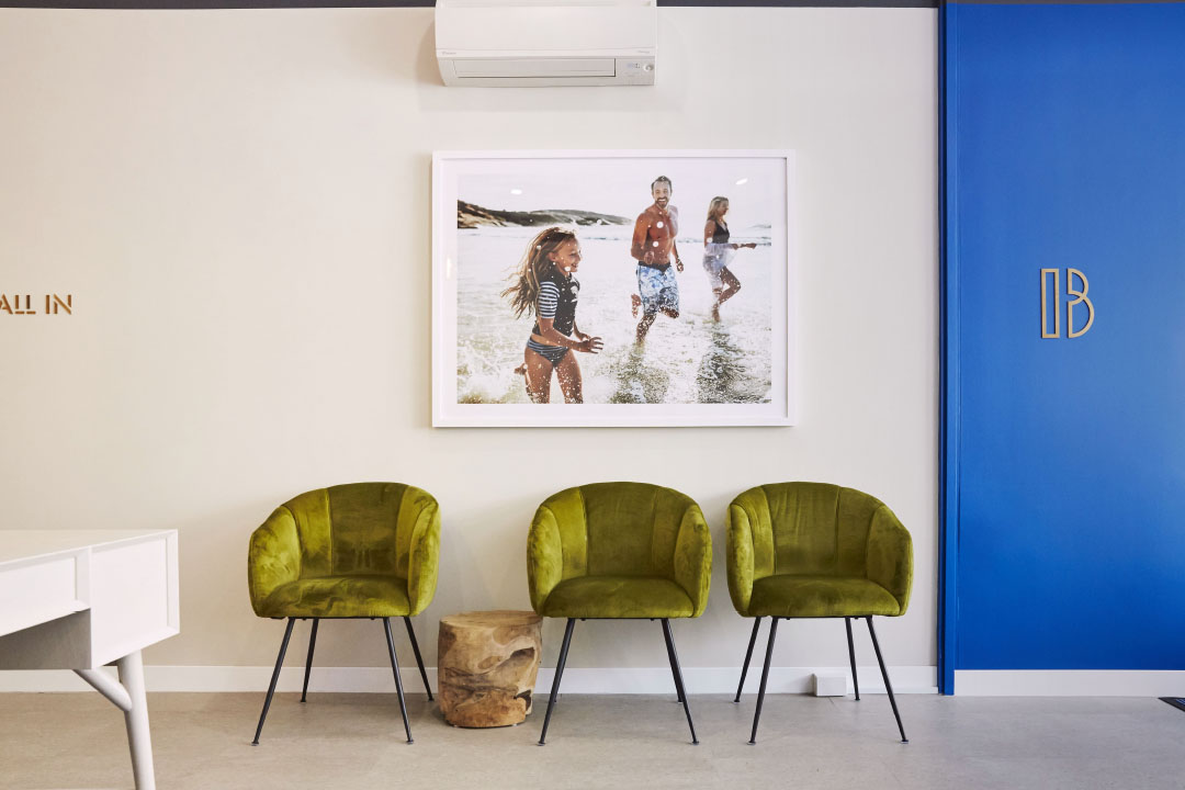
There was a strong desire to push against the usual tropes in the space as well — stock imagery of elderly people, clinical branding, long-winded copy and service lists, all lacking personality in an attempt to enhance expertise.

In order to be different and challenge the status quo of a well known industry, every aspect was filtered through the lens of the Brightside values and what they were fighting against — when they zigged, we zagged.
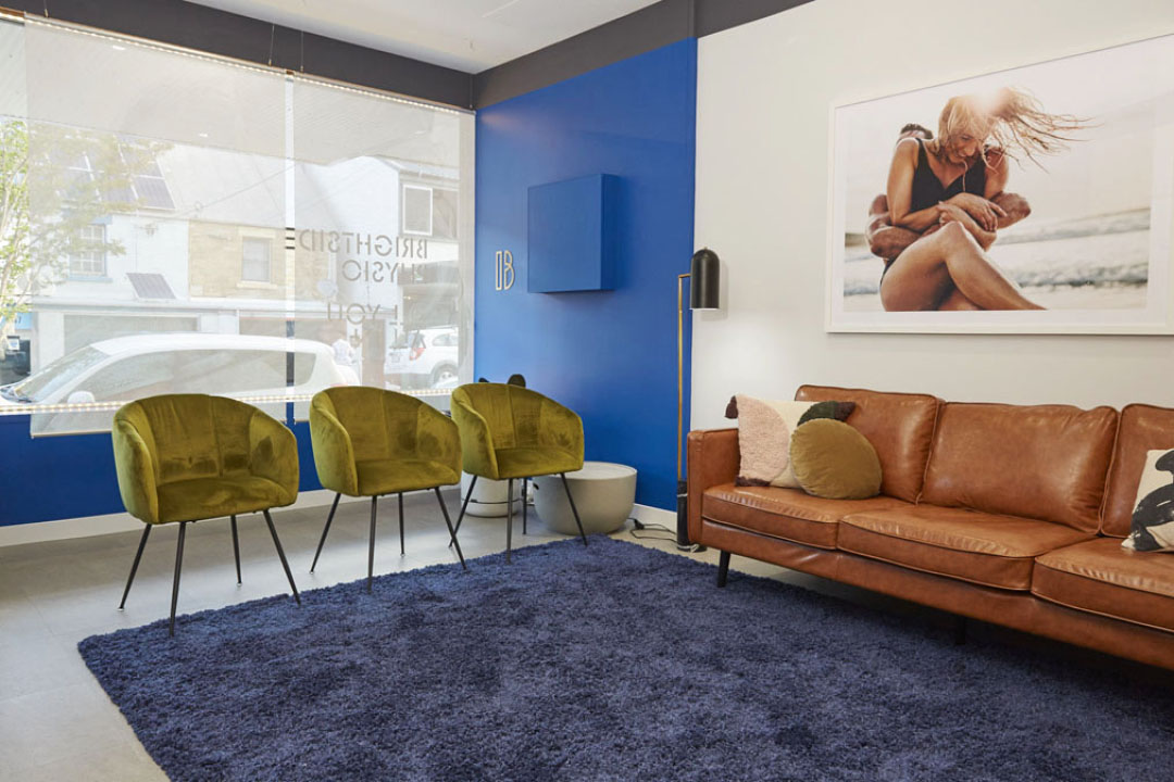
The target audience is busy mums who don’t mind treating themselves. We wanted to lean into the practise as a space for self-care. A feeling of a little luxury and being totally at home so they could relax and feel comfortable.
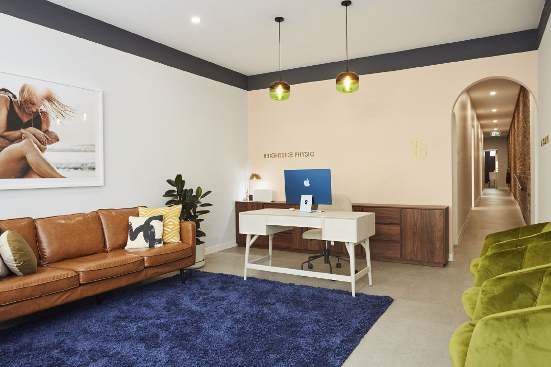
The client experience needed to feel like they were in a beautiful living space and not a clinic. Visiting the physio became about about optimism toward a brighter future. Everything from tone of voice, brand design, the feel of the welcome room (aka reception) was thought through to enhance life and hope.
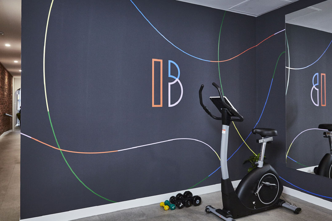
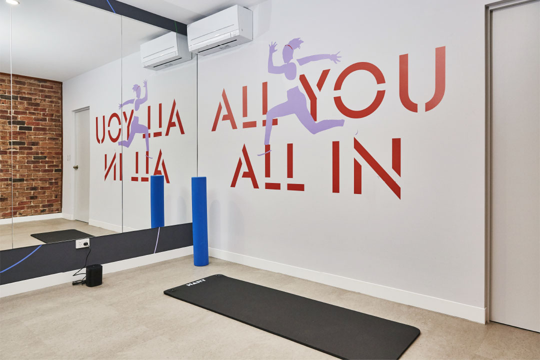
The ‘B’ identity is aspirational and athletic. The tagline follows with “All You All In” — far away from a pain you put up with. Supported by imagery of mums in their ‘best life’, having fun and living life on their terms and illustrations that inspire creativity. The palette rainbow is vivid yet nonabrasive. The tone of voice, cheeky and fun.


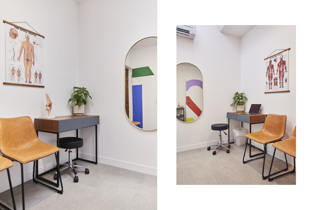
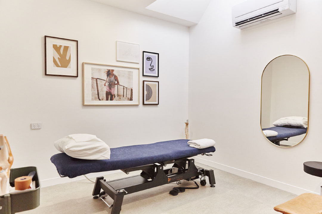
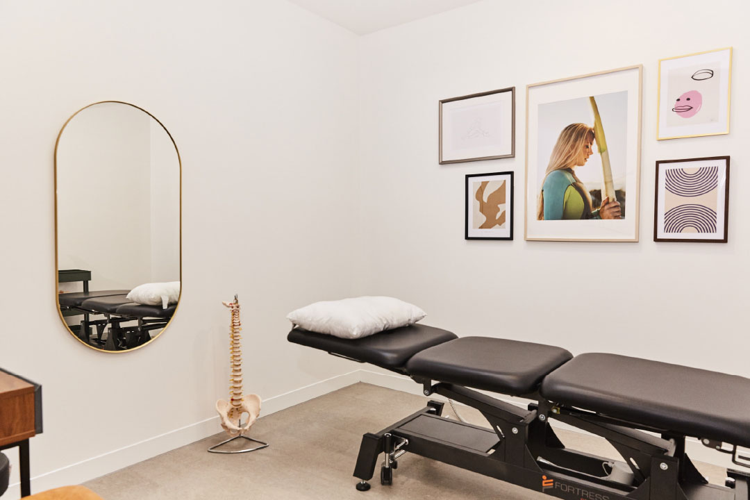
To complete the brand experience, we had the opportunity to totally design the clinic interiors from scratch— from the welcome room, to patient rooms, the gym and staff quarters. The feeling is a beautiful, relaxing space, with soulful tunes, and soothing energy.
Where there are typically tall reception counters we replaced with a beautiful study desk. Where there were grey couches and carpets, we replaced with considered furnishings, lamps and rugs.
The treatment rooms are adorned with lifestyle imagery and art. The gym has wall to ceiling mirrors between two brand walls.
Clinic build progression